A look back through the ‘Lark-ive’
To celebrate the launch of our new-look website, the team reveal their favourite projects, from legacy giving to living in a police state.
We’ve recently given our website a make-over - insert 1980s movie montage of geeky girls removing their glasses to reveal the gorgeous tone of voice guidelines and beautiful brand messaging that were there all along!
As we were going through the archives, it made us realise not only what an incredible list of clients we have but the empowering and (sometimes) life-changing work we do for them.
So, we asked each Lark to pick the project they’re most proud of. Once we’d whittled down our packed lists, these were the clear winners.
Roz
My favourite project: Creating the ‘Living with dementia’ guide for Dementia UK as part of their ongoing brand awareness campaign. It combined everything I love about my job: researching a deeply important topic, writing for a specific audience and creating something really helpful. Over 39,000 have been downloaded so far!
Sarah
My favourite project: Producing the award-winning “Just a Period” campaign and series of videos for Wellbeing of Women. It was the perfect storm of a scroll-stopping creative concept and powerful user-led content. The fact this incredible campaign has been honoured with so many awards is the icing on my cake.
Iddo
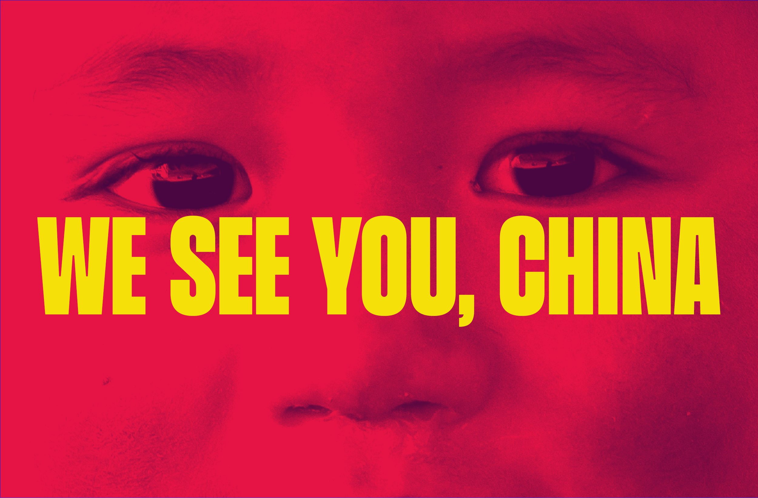
My favourite project: Free Tibet’s tone of voice. A harrowing injustice and a compelling cause, but the project also threw up all sorts of interesting/nerdy comms problems for me, like how to create urgency without evidence (Tibet is a police state so very little information gets out) and how to be angry without alienating people.
Paul
My favourite project: Honestly, it’s usually the latest one (and if you’re a Lark client reading this, it’s yours!). Looking back, I always feel proud about the work we did for Oasis Project, an organisation that helps incredibly vulnerable people, who often don’t elicit much sympathy from the public. We helped them to find the right words to speak their truth and change people’s perceptions, and create a beautiful visual identity that feels incredibly hopeful.
Anna
My favourite project: Kew Gardens tone of voice guidelines. It was such a thrill that our discovery phase included walking round the stunning botanical gardens at Kew. And I’m proud of us for bringing excitement and wonder together with scientific expertise into the organisation’s brand language, creating a much richer and warmer visitor experience.
Jess
My favourite project: Health Equalities Group. I wasn’t part of the visual identity discovery phase, which started before I joined Lark, but I was involved in creating their logo and asset animation. It was a great introduction to the team to see the thought, time and pride Lark puts into all their work, and it was so exciting to see ‘my’ logo out in the wild!
Scott
My favourite project: Nature Neighbourhoods. Apart from being a really great initiative, the thing I was instantly excited about was the fusion between nature and the urban environment. Bringing these two elements together to create some fun and simple illustrations was a joy to work on.
Meghna
My favourite project: A brand new legacy project for Bowel Cancer UK - they’ve been such a lovely client to work with, and it's such an important issue. I think our idea was beautiful and the contributors were all so wonderful and open on film. I really loved creating the video stories for this project.


