What can copywriters learn from children’s books?
Counting, colours, and… copywriting tips? Find out what the likes of Don Draper can learn from Dr. Seuss.
The average person doesn't usually read copy to luxuriate in the complexity of the English language. If they want to read something impenetrable they’ll pick up a copy of 100 Years of Solitude. As a copywriter, you’ll want to aim squarely at Where The Wild Things Are.
We’ll get into the details, but the most basic copywriting skills or lessons we can take from children’s books are:
They’re short
They use simple language and are easy to read
They are written to be read aloud
The words are designed to be seen on the page.
Keep it simple, stupid
Brevity is key.
The trick to holding the attention of overtired three-year-olds and time-poor office workers alike, is to keep it short, clear and captivating. The best children’s books will typically contain less than 200 words each.
Some of the best ads contain none at all.
This means that every word you use has to have a very good reason for being there.
Simplicity in digital copywriting doesn’t mean dumbing down. But if you’re asking your audience to change their behaviour in some way, don’t make simply reading the call-to-action the first barrier.
Above all, keep in mind the readability of your writing. Sticking to a fourth grade reading level (unlike this article) is a good way to ensure comprehension, conversion or any other purpose of your copy.
If it’s hard to read, it’s hard to do
In the aptly named study, If It’s Hard to Read, It’s Hard to Do (Processing Fluency Affects Effort Prediction and Motivation), people who were given a recipe in an easy-to-read font (Arial, 12 point, in case you were wondering) were more likely to think that the dish was easy to prepare.
What’s more, they were more able to recall the information afterwards – an undeniably important feature of good copy.
Participants who were given the same instructions in a difficult-to-read font (Mistral, 12 point) judged the same task to be much harder, and could recall less of it.
The researchers concluded that people will associate the ease of the task (e.g. buy this product, donate to this charity, sign up to this newsletter) with the ease of reading.
If your readers find your writing difficult to read, they will subconsciously assume that your call-to-action is difficult to do.
Look and feel
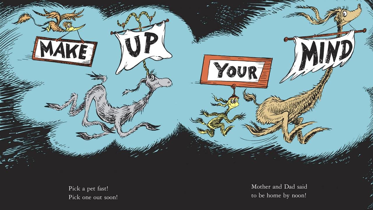
Then we have the often-overlooked defining feature of kids' books: the words are designed to be seen on the page.
They interact with the images and design and they convey their meaning, mood and momentum through their shape and form.
So you can't just leave the design to the designer – think visually about your content writing as you go.
And finally, empathy.
We often read novels to put ourselves in the shoes of others, but good copy and good children’s books will come to you. When writing these, you need to walk a mile or 10 in the shoes of your audience and write like they think.
You can’t assume too much. Don’t think your reader has the knowledge that you have. Don’t imagine they “know what you mean”. Don’t believe they are familiar with the idioms, allusions and euphemisms that you feel are commonplace.
And don't assume that they want to read what you've written for the sake of it. They'd probably rather be playing on the iPad.
Read our blog for more copywriting secrets…


