Clickbait is useful – the reason will shock you…
Clickbait. Who actually clicks on it? The answer is everyone – yes, even you.
What is clickbait?
You know those posts you see on social media that promise to reveal 10 Stunning Life Hacks To Change You Life For Ever (sic)? Or the Quiz which tells you which 80’s movie is most like you? That's clickbait. They use intriguing, overstated headlines (often with poor grammar and spelling), images and underhand tactics to bring in the clicks.
The reason these cheap, silly and often totally absurd posts permeate our social media feeds is that they take advantage of some very powerful quirks of the human psyche.
Who is clickbait for?
The reason clickbait exists is to sell cheap (often nasty) online advertising space – usually through a deliberately poorly designed website. The biggest hurdle in this business model is attracting enough people to serve the ads to.
That’s where clickbait comes in. Those dodgy website owners can employ cheap, often poor quality, content creators to update their sites, social media pages or accounts. The end goal is to encourage easily influenced people to visit the sites from social media and see those ads, possibly even clicking on some of them.
The spelling mistakes and bad grammar only help to weed out people who would usually avoid clicking on dodgy links with poor spelling. Win, win!
Why does it work?
However sophisticated we think we are, we all still have basic animal instincts that govern our behaviour. Clickbait appeals to the limbic system in our brains (sometimes referred to as our ‘lizard brain’).
This is the "oldest" (evolutionarily speaking) and most primitive part of the brain and deals mostly in instinct and emotion. This, unfortunately, also means that its wants and whims are very difficult to ignore.
Closing the circle
There’s a reason this image makes your eye twitch.
Your primitive brain is wired for pattern spotting, resolution and order – and it loves nothing more than a neat bundle of information.
So, for the same reason that you are itching to straighten that manhole cover, when you’re told that something will shock you, your limbic system starts screaming out to know if it will.
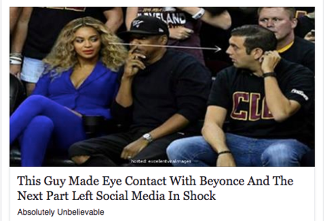
When you encounter a clickbait headline such as “This Guy Made Eye Contact With Beyonce And The Next Part Left Social Media In Shock”, the urge to find out the rest can be overwhelming. Even if, logically, you know it’s trash.
(Spoiler: they got a selfie together – now you can sleep at night.)
How can you use these principles for good (or evil)?
The main, and most obvious, characteristic of clickbait is to hook people with an intriguing headline and image. While this isn’t a new tactic (newspapers and magazines have been at it for years) online publishers have only recently arrived at the party.
The idea is to sell the sizzle of the sausage, to add the spice before the rice. Get people into the article and then keep them interested. Hook first, then educate.
Break it up and keep it short
Clickbait articles make good use of subheadings. They’re great for keeping your readers interested enough to carry on while breaking up blocks of copy. You don’t have to add too much detail, just enough to show that there’s more valuable information to come.
If you keep telling readers where they are in an article they're much more likely to get all the way to the end. So “your top ten biscuits” will work better than a rambling undefined post about “your favourite cookies”.
Show, don’t tell
It’s all about quick fixes – so clickbait articles are copy light, preferring to use images to paint the picture. Images with captions are – according to a David Ogilvy study – read 300% more than body copy. Didn’t you skim through this post and read all the captions first?
Something for nothing
It’s a great idea to give your readers something in return. Quizzes may seem ridiculous but they give people something in return for visiting your site.
They’re also great to share – if your friend discovers their spirit animal you’ll want to make sure that yours is not a lizard.
Read our blog for more design and copywriting tips…


