

Opportunity knocks
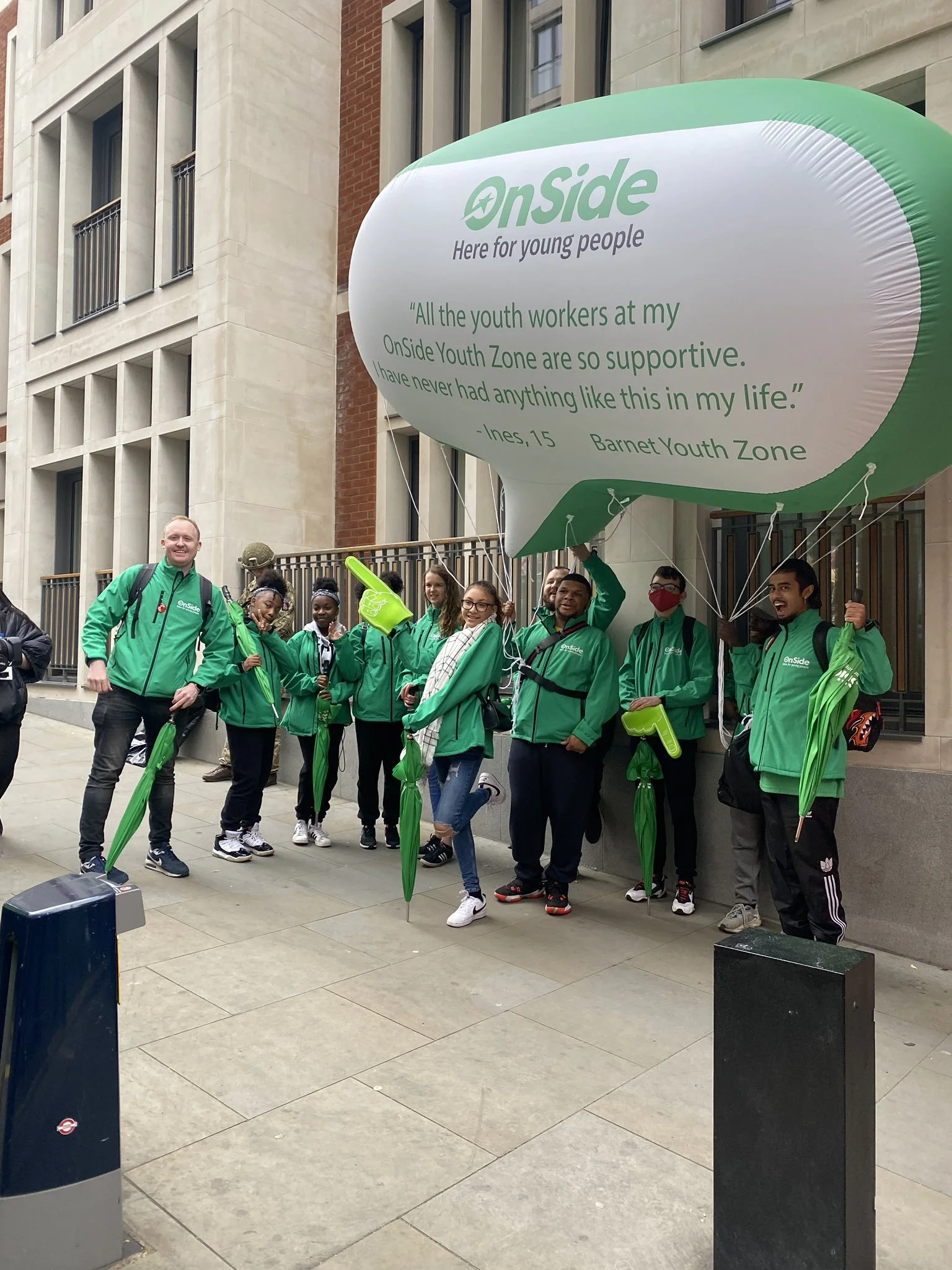
OnSide
Visual and verbal identity
Helping OnSide level the playing field for young people with a vibrant, energetic rebrand.

What we did
Positioning
Messaging
Copywriting
Tone of voice
Visual identity
Illustration
Brand guidelines
When we really invest in young people, we all benefit. From who they are now, everything they might become and achieve, everyone they might touch and inspire.
OnSide are a unique organisation. They fund, build and run incredible, state-of-the-art ‘Youth Zones’ in the country’s most disadvantaged areas, giving kids and young people the opportunity to discover what they’ve got and where it could take them.
But back in 2020, their brand didn’t express this inspiring vision. Its look and feel was drab and dated. Its language was flat and formal. Its positioning focused too much on the challenge and not enough on the opportunity.

Through a series of deep-dive consultations with kids and families, corporate funders, local politicians and staff at the Youth Zones, we gained a real understanding of the charity’s problems, purpose and personality.
Reflecting on what we’d heard and learnt, we realised that at heart, OnSide’s work all about opportunity. Because potential is everywhere. It sprouts just as spiritedly in inner-city estates as in leafy, suburbs. The difference is that some young people get every opportunity to explore their potential, and others don’t.
But imagine if they did. Imagine what that could do for their lives, their communities and our society.


First, we produced a bold new brand narrative and messaging that shifted the focus away from disadvantage and need, towards potential and opportunity.
Then we carried this new positive tone into the visual identity with a vibrant new logo, colour palette, graphic devices, icons and fonts, as well as comprehensive guidelines to show how they should be used.


